A call to action is the line that tells a reader exactly what to do next and what they get for doing it. The examples below are grouped by where they appear, from landing page buttons to email links to paid ads, and each real example is paired with a before and after rewrite plus the split-test data behind why the stronger version wins.
Last reviewed: September 2026
What makes a call to action convert
A call to action converts when it names one specific action with a verb, shows the value waiting on the other side, and matches the reader’s stage in the buying process. Vague labels like Submit, friction words, and second-person distance all cut click rates. The strongest buttons read as the reader’s own decision, not an order from the brand.
- Action verb first: Get, Start, Claim, Send, Show, Build, Reserve, Save.
- Named outcome: say what the reader receives, such as a quote, a template, or a plan.
- First person where it fits: “Start my free trial” beats “Start your free trial” in tests.
- Length of two to five words: long enough to name the action and the value, short enough to scan.
- Funnel match: a cold reader gets “Show me the pricing,” a warm one gets “Book my call.”
Our marketing copywriting work starts every CTA from these five checks before a single word gets tested.
Call to action examples by placement
The same offer needs different wording depending on where it sits. A landing page button, an email link, a paid ad, and an exit popup each carry different reader intent, so the CTA copy shifts to match. Below are real examples from named brands you can adapt to your own funnel and landing pages.
Landing page and hero buttons
On a hero section the reader is deciding whether to commit, so the button trades on low risk and speed. Shopify uses “Start free trial,” Notion uses “Get Notion free,” and Slack uses “Try for free.” Each pairs a verb with a zero-cost outcome, which is why they anchor most lead generation landing pages.
Email calls to action
Email readers already opted in, so the CTA can be more specific and personal. Strong lines include “Claim my seat,” “Send me the guide,” and “Resume my order.” A single primary button beats a wall of links, and first-person phrasing keeps the click feeling like the reader’s own choice rather than a broadcast.
Paid ad and social calls to action
Ad CTAs interrupt a scroll, so they name the payoff fast. Examples that work include “Show me the plans,” “Get my free quote,” and “See the demo.” On Instagram and Facebook, direct-message prompts such as “DM us the word PLAN” have become one of the higher-converting formats because they lower the step from interest to reply.
Exit popups and blog anchor text
A popup catches a leaving reader, so it offers a reason to stay: “Send me the discount” or “Save my cart.” Inside articles, anchor-text CTAs like “Download the free template” sit mid-paragraph where intent is high, a tactic proven across our content marketing playbook.
| Placement | Real example CTA | Why it works |
|---|---|---|
| Landing page button | Shopify: “Start free trial” | Verb plus zero-cost outcome at the decision point |
| SaaS hero | Notion: “Get Notion free” | Names the product and the price in three words |
| “Claim my seat” | First-person ownership for an opted-in reader | |
| Paid social ad | “Show me the plans” | Names the payoff to justify the interrupted scroll |
| Exit popup | “Send me the discount” | Gives a leaving visitor a reason to stay |
| Blog anchor text | “Download the free template” | Sits mid-article where reader intent is high |
Before and after: CTA rewrites that lift conversions
The fastest way to see what changes a click is to compare a weak CTA with its rewrite. Each pair below keeps the offer identical and edits only the wording, so the lift comes from language, not a new deal. The change column names the single edit that did the work.
| Before | After | Change made |
|---|---|---|
| Submit | Get my free quote | Verb plus named outcome plus first person |
| Learn more | Show me the pricing | Specificity replaces a vague label |
| Book a demo | Talk to a human | Plain wording removes sales jargon |
| Start your free trial | Start my free trial | First-person ownership over second person |
| Sign up | Start my 30-day free trial | Adds a timeframe and a risk reducer |
| Contact us | Get my marketing plan | Trades a channel for a concrete deliverable |
What the data says about CTA conversion lift
Reported split tests show that small CTA edits can move conversion by large margins, though the size varies by audience and offer. The chart and figures below come from named studies, not estimates. Treat each number as the result one team saw in one test, and confirm the pattern with your own experiments before you bank on it.
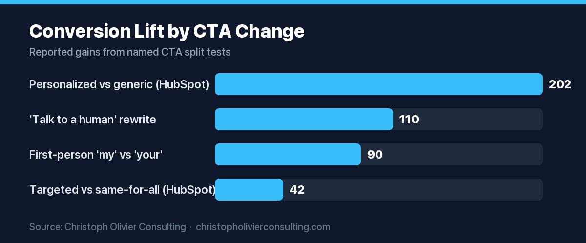
- Personalized versus generic: HubSpot analyzed more than 330,000 CTAs over six months and reported personalized (“smart”) CTAs converted 202% better than a version shown to every visitor.
- Targeted versus same-for-all: the same HubSpot dataset reported targeted CTAs turned 42% more viewers into leads than an untargeted version of the same offer.
- Plain wording: Mailmodo reported that changing “Book a demo” to “Talk to a human” raised its homepage conversion rate from 0.29% to 0.61%, a reported lift of about 110%.
- First person: ContentVerve’s Michael Aagaard reported that switching a button from “your” to “my” lifted click-through to the payment page by 90%.
How to write a call to action in five steps
A repeatable CTA follows the same order every time: pick the one action, name the payoff, add ownership, cut friction, then match the reader’s stage. Work through the steps in sequence and you get a button that reads clearly and gives you a clean variable to test later.
- Pick one action. Decide the single next step and remove competing buttons around it.
- Name the payoff. Add the outcome, such as a quote, a template, or a plan, so the value is explicit.
- Add ownership. Use first-person phrasing where it reads naturally, such as “Get my plan.”
- Cut friction. Add a risk reducer like “free,” “no card,” or a timeframe, and delete filler words.
- Match the stage. Soften the ask for cold traffic and sharpen it for warm, ready-to-buy readers.
How to test your call to action
Testing turns opinion into evidence: change one element at a time, split traffic evenly, and run the test until the result is stable rather than stopping at the first good day. Button copy, first-person phrasing, and the risk reducer are the highest-yield variables, so start there before you touch color or placement.
If you want a second set of eyes on your funnel wording and test plan, our consulting services cover CTA copy, landing page structure, and the experiment roadmap that ties them together.
Frequently asked questions
What is a good call to action example?
A good call to action example names one action and its payoff in a few words, such as Shopify’s “Start free trial” or “Get my free quote.” It leads with a verb, shows what the reader receives, and often uses first-person phrasing so the click feels like the reader’s own choice rather than a command from the brand.
What are the best call to action words?
The strongest CTA verbs are Get, Start, Try, Claim, Save, Build, Reserve, Send, and Show, because each names a concrete action. Pair the verb with an outcome, for example “Get my quote” or “Show me the pricing,” and keep the phrase between two and five words so a reader can scan and act in a fraction of a second.
How long should a call to action be?
Aim for two to five words on a button. That range is long enough to name both the action and the value, and short enough to read at a glance. Longer supporting text can sit near the button as microcopy, such as “No card needed,” but the clickable label itself stays short so the choice is obvious and fast.
Do personalized CTAs really convert better?
In HubSpot’s analysis of more than 330,000 CTAs over six months, personalized CTAs converted 202% better than a version shown to every visitor. Treat that figure as one large study rather than a guarantee, since results depend on audience, offer, and traffic. The safe read is that matching the CTA to the reader tends to beat a single default for everyone.
What is the difference between a CTA and a button?
A button is the visual element a reader clicks; the call to action is the wording and intent behind it. A CTA can also live in anchor text inside an article, in an email link, or in a spoken ask. The button is the container, and the CTA is the message that tells the reader what to do and why.
Where should you place a call to action?
Place a primary CTA where reader intent peaks: the hero section of a landing page, the end of a persuasive email, and mid-article anchor text where the point has just landed. Repeat one consistent CTA rather than scattering competing offers, and add an exit popup only when it gives a leaving visitor a genuine reason to stay.
More marketing guides for rank on ai: get cited by ai search
- CMO Salary in 2026: Base, Bonus, and Total Comp by Company Size
- Color Psychology in Marketing: What Colors Signal and How to Use Them
- What Is a Customer Success Manager? Role, Metrics, and Salary
- How to Write an Elevator Pitch (Structure, Template, and Examples)
- Unique Selling Proposition (USP): Definition, Formula, and Examples
- What Is a CMO? Role, Responsibilities, and Pay
- Rank on AI: Get Cited by AI Search